 Forums

Creating websites so that they display the same on all browsers and platforms for all vendors is tough business. Designers aim for "One size fits all" but sometimes, even with the best of incantations, "One size fits most" is the end result.
Case in point, Eric's simple goal: learn more about Asus' Transformer Book. All that he wanted to do was to pull up http://transformerbook.asus.com/ on his Ubuntu laptop and marvel at the dynamic animations and glitzy transitions between product features but instead all he got was a screenful of ugly. No text styling, a couple of images, but mostly just blah-looking plain text.
Considering this to be strange, he pulled up the same site on a friend's MacBook and on there, everything was normal.
Curious, he opened up the developer console in his browser and saw this:
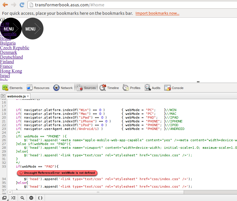
Yep, that's right - since Eric's laptop isn't a Windows or Mac based machine, an iPad, iPhone, or Android device, the JavaScript just dies, leaving him stuck in a lurch.
...but the WTF's don't stop there.
Below is the full JavaScript source for your reading enjoyment (source). For fun, compare it to how it fits in with the rest of the site and wince as you learn the script's purpose.
// JavaScript Document
(function(){

    isIE = navigator.userAgent.search("MSIE") > -1;
    isIE7 = navigator.userAgent.search("MSIE 7") > -1;
    isIE10 = navigator.userAgent.search("MSIE 10") > -1;
    isFirefox = navigator.userAgent.search("Firefox") > -1;
    isOpera = navigator.userAgent.search("Opera") > -1;
    isSafari = navigator.userAgent.search("Safari") > -1;//Google瀏覽器是用這核心
    if(isIE7){}
    if(isIE){}
    if(isFirefox){}
    if(isOpera){}
    if(isSafari){}
    if(isIE10){}


    if( navigator.platform.indexOf("Win") == 0 )        { webMode = "PC";    }//WIN
    if( navigator.platform.indexOf("Mac") == 0 )        { webMode = "PC";    }//MAC
    if( navigator.platform.indexOf("iPad") == 0 )       { webMode = "PAD";   }//IPAD
    if( navigator.platform.indexOf("iPhone") == 0 )     { webMode = "PHONE"; }//IPHONE
    if( navigator.platform.indexOf("iPod") == 0 )       { webMode = "PHONE"; }//IPOD
    if( navigator.userAgent.match(/Android/i) )         { webMode = "PHONE"; }//ANDROID
    /*     if( webMode == "PHONE" ){         $('head').append('<meta name="apple-mobile-web-app-capable" content="yes" /><meta content="width=device-width, initial-scale=1.0, user-scalable=no, minimum-scale=1.0, maximum-scale=1.0" name="viewport" /><link type="text/css" rel="stylesheet" href="css/index_phone.css" />');     }else if(webMode == "PAD"){         $('head').append('<meta name="viewport" content="width=device-width; initial-scale=1.0; maximum-scale=1.0;"><link type="text/css" rel="stylesheet" href="css/index.css" />');     }else{         $('head').append('<link type="text/css" rel="stylesheet" href="css/index.css" />');     }     */
    if(webMode == "PAD"){
        $('head').append('<link type="text/css" rel="stylesheet" href="css/index.css" />');
    }else{
        $('head').append('<link type="text/css" rel="stylesheet" href="css/index.css" />');
    }
})();
 [Advertisement]
BuildMaster allows you to create a self-service release management platform that allows different teams to manage their applications. Explore how!
[Advertisement]
BuildMaster allows you to create a self-service release management platform that allows different teams to manage their applications. Explore how!