Recently, when Jeff T’s credit union enhanced its online banking, it forced him to re-register his account under the new system. He thought that this was strange because, well, the "old" system was fairly reasonable. Beside the usual username and password, they had your typical Wish-It-Was Two Factor authentication and an even anti-phishing image presented during the logon process to make you feel that much more secure. It wasn't great, but it wasn't Harland Financial bad.
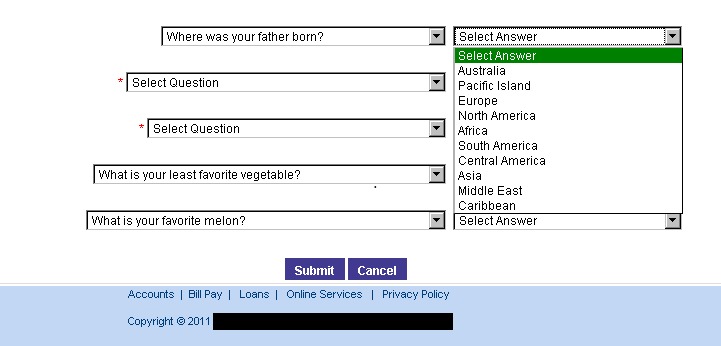
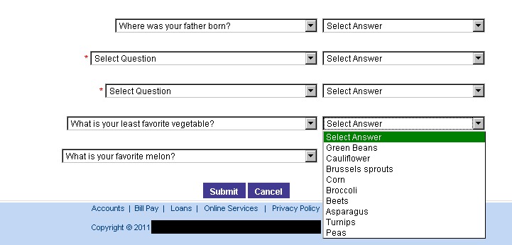
However, this new system didn’t inspire a ton of confidence. First, were the security questions. The previous security questions allowed for any old free-typed answer, but instead, they were replaced with different set of really dumb questions, each one limited to a dropdown of possible answers.
For example, for a credit union in the United States, the below wouldn't be very hard to guess.

Also, least favorite vegetable? Favorite type of melon? Perhaps the web developer was hungry.

Finally, the security image at the end of the login process was replaced with a CAPTCHA that could easily be defeated by spambot with a head cold.

Granted, Jeff’s original a picture of kitten didn’t scream "secure", such an easy to solve CAPTCHA sort of said "we stopped caring around this step".
Later, when Jeff asked why they had elected for the redesign, the credit union representative explained that the changes were in response to the many complaints that their online banking wasn't "smartphone friendly". Apparently enough users disliked answering security questions on a virtual keyboard to the point that they had threatened to take their business elsewhere and, when compared to losing customers, investing in a site redesign made more sense.
In the end, Jeff kept his account at the credit union, but didn’t complete the new online registration. He figured that the act of physically travelling to the branch would do his body some good...and worth the peace of mind.

