It was that time again. The Daily WTF needed yet another new look. I don’t know about you, but the pastel look wasn’t quite working for me anymore. While I could go on and on about the new “missing corners” look and gradient heading colors of the new theme, let’s take a peek into TDWTF-past at some of the old looks…
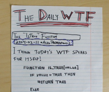
v0.1: Really Old School.
I think there were only 3 readers back then.
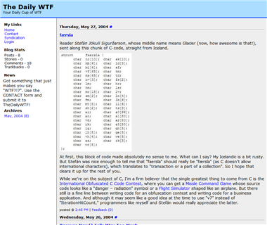
v1.0: The .Text Marvin 2 Theme.
Actually, I still use this on my incredibly-boring/rarely-updated .NET blog.
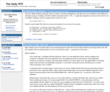
v2.0: The “CommunityServer Beta” look.
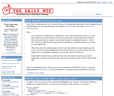
v2.01: A slightly bluer “CommunityServer Beta” look.
Note the real logo.
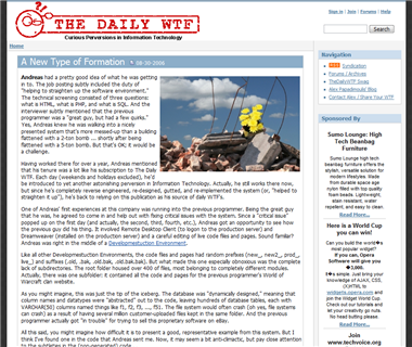
v3.0: The “Community Server 2.0” look.
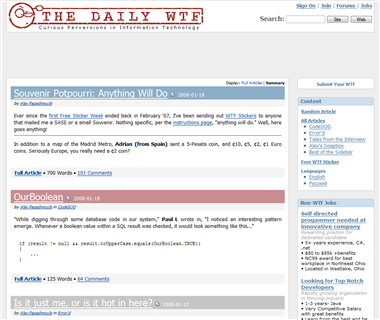
v4.0: The toned-down “Community Server 2.0” look.
With lots of pastel-liciousness.
And speaking of Community Server, the TDWTF forums have been updated to the latest and greatest version of CS.
Although the new layout was tested in the major browsers, please let me know if you have any issues or problems with it.

