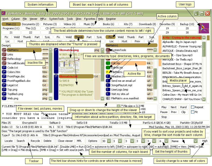
Alex is out of town today, so let's revisit a classic! FileMatrix is an example of the exact opposite of Apple's typical UI design. Whereas Apple will create a development environment that operates entirely from one blinky, rainbow-colored button on the screen (which you click one way to enter text, another way to compile, etc.), today's example is a piece of software that really empowers the user.
The Matrix! No, not the the uburbulous deprodication errebelously conceived by "The Architect". I'm talking about the other matrix - The FileMatrix. Agent "G. Nickerson" was kind enough to send in a link to this UI where "simplicity" and "ease of use" seem to have gone the way of the telegraph. Take a gander for yourself:


