A little while back, I posted a user survey and asked for some general comments -- thanks to everyone who replied and shared their thoughts. I was hoping to share the survey results sooner, but I got a bit caught up in that Release! Kickstarter project.
In addition to some basic demographics questions, the survey asked some questions about a site redesign:
It's been a long while since the look and feel of The Daily WTF has been updated. The last update was a little over six years ago when MySpace was still king, Twitter was a silly new fad, and the iPhone was but a few months old. We experimented with a new look on the OMGWTF2 Contest Mini-site, and got some pretty positive feedback.
In an effort not to pull a Slashdot (or worse, the rename that shall not be named) , we wanted to ask you, the reader, what you think about an updated look and feel.
But before I get to that, some quick observations on the demographics.
- We're basically all male. Not really a surprise, but the percentages of female respondents was smaller than I expected (only 3.6%)
- Older and wiser. There's a lot of sensationalist talk about how all good programmers die at 30… but fortunately, those kids are supplying us with as steady stream of content. We're primarily (65%) 30+ years old, and only a handful (<9%) are under 24.
- Generally experienced. Almost all of us (90%) have 2 years experience in the industry, which makes sense given the content; it was nice to read comments from students and newbies that TDWTF was their how-not-to guide
As for the redesign, the overwhelming opinion is… indifference. I think Respondent #5577's comments sums up the sentiment best…
The current UI is a bit dated, but there's nothing wrong with it. I come for the content, not the eye candy. Wouldn't mind a redesign. Wouldn't mind if it stayed the same.
There weren't that many of you who were vehemently against updating the look & feel, but a lot of you shared some perfectly-valid concerns…
- don't break the rss feeds
- As long as you keep the Side Bar and featured comments I won't complain about a new design. I promise.
- if you do make a mobile version, please make sure its easy to switch to the desktop version on a mobile device.
- My experiences with 2 other sites similar in format to Daily WTF (but totally different topics) is that a big change of layout and style will cause people to leave.
- Please don't change the site just for the sake of changing something
- more rounded corners or riot
You can download the full dataset if you'd like.
The Site Redesign
I know most of you don't care one way or another, but I've grown weary of the current look, the poor readability, and of course the codebase that powers the front page. I love the community and content that we've all built over the past decade, and I'd love to make it look great.
The Daily WTF is not a professional publication run by some media conglomerate -- it's a hobby site run by a few folks with day jobs. The upside to that is we're not beholden to corporate-driven metrics like page view maximization and visitor retention. On the other hand, we don't have the dedicated resources for big projects like this – which means it'll take longer, and we may have to compromise on the nice-to-haves.
That said, I've been working with a designer and another developer over the past few months on this project, and I think I've finally got a rough draft to show. I was hoping it'd be long complete by now, but it still has a ways to go --- and hopefully that's where you can help. I've already shared some of my feedback on the project Issue Tracker. Before you share your feedback, few notes…
- Redesign goals (in order of importance)
- Article readability
- Old/other article discoverability
- Mobile usable
- Author prominence
- Codebase
- .NET MVC / SQL Server
- Sources at https://github.com/tdwtf/WtfWebApp
- Status
- Draft version
- Still needs work
- old data import
- lots of broken bits & pieces
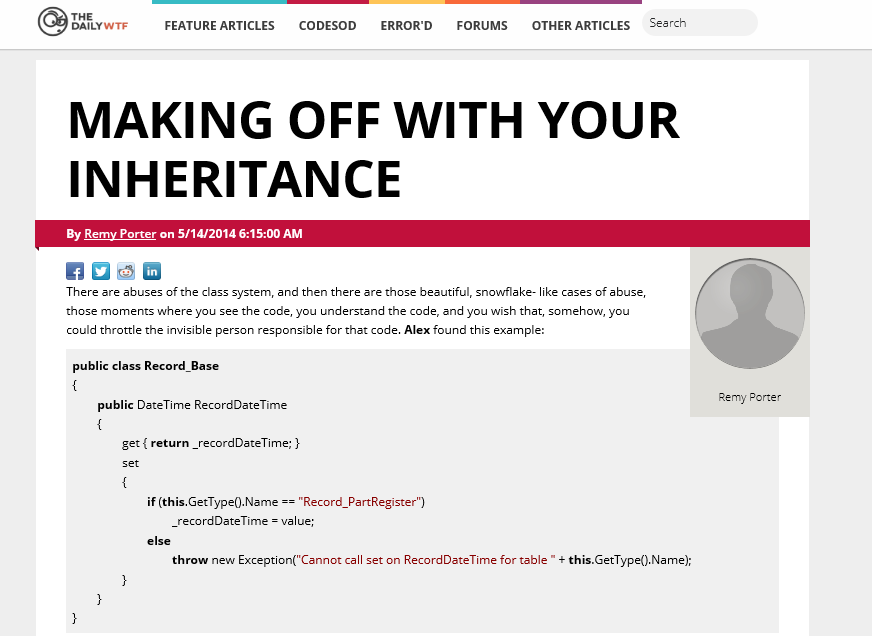
Without any further ado, here's the article page:
The other pages (home page, article nav page, etc) are still a bit rough. You can see more for yourself at http://thedailywtf.com:1000/
Feedback (and of course pull requests), would be much appreciated.


