 Every once in a while, some one shares with me the story of an unimaginably convoluted system. A system so complex, so twisted that the mere thought of maintaining it has driven many a men insane. A system so heinous and so evil that the souls it has claimed are outnumbered only by COBOL itself. So, in hopes that its presentation might offer some consolation to John and its other unfortunate victims, I will share with you the story of The Customer-Friendly System.
The Customer-Friendly System, like so many of its kind, was spawned in the bowels of a behemoth corporation at the hand of a giant consulting company. Its purpose was to automate the complex processes required to originate, route, approve, underwrite, and fund various types of business and consumer mortgages. And it was "Customer-Friendly" because the consultants wanted to design it so that "even the most technically unskilled end-user could easily add and modify" its complex workflow modules.
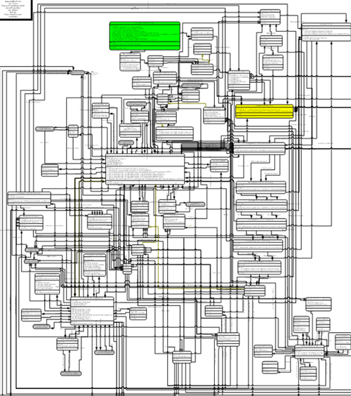
To give you an idea of what "Customer Friendly" means, take a look at this next image.

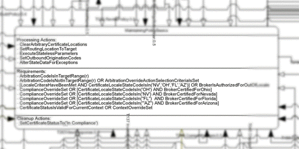
When I first saw it, I thought it was some sort of circuit diagram. Actually, it's a Visio diagram (12 of 136) that contains one of these complex workflow modules. Let me rephrase that: the diagram doesn't represent the workflow or show how the workflow is coded, it is the workflow. Let's take a look at a closeup.

Though it may seem like it, that block is not a standard Visio component. It's a "Workflow Action" custom-component that was developed by the consultants. Each of these Workflow Action blocks is linked-to and linked-by several other Actions, which may be defined in the same Visio diagram, another Visio diagram, or an external J2EE module.
The system core utilizes these Visio diagrams for its business workflow logic and dynamic user interface generation, and it is through these diagrams that the system is "Customer Friendly." To add or change functionality to the system, all the "technically unskilled" end user would need to do is modify one of these diagrams. It was that simple.
Obviously, no end user ever saw or touched these diagrams. Though the "proof of concept" was simple enough for a "technically unskilled" user, changing the workflow logic on the full-developed system required a highly-trained programmer and a highly-powered desktop (2-4GB RAM). And that's where John came in; he actually managed to make it through the six months of "peer training" required to "program" the diagrams.
The final straw for John was when he was tasked with making a "simple UI change." That's when he learned that, to make the generated UI more usable, the system allowed for developers to incorporate JavaScript "tweak files." What ended up happening is that the entire front-end became JavaScript: it did everything from displaying a navigation bar to validating data on the form.
And what was John's simple UI change?, you might ask. It was to "use the [JavaScript] HTML Parser (/inc/p2/v/hparser.js) to filter out Iowa-specific text before it's passed to the page renderer (/inc/p2/v/hrenderer.js)."

